CHOCOTTONE 🌱
CLIENT
BAUDUCCO
BAUDUCCO
Bauducco Chocottone
Project: Pharus Bright
Project: Pharus Bright
PROJECT
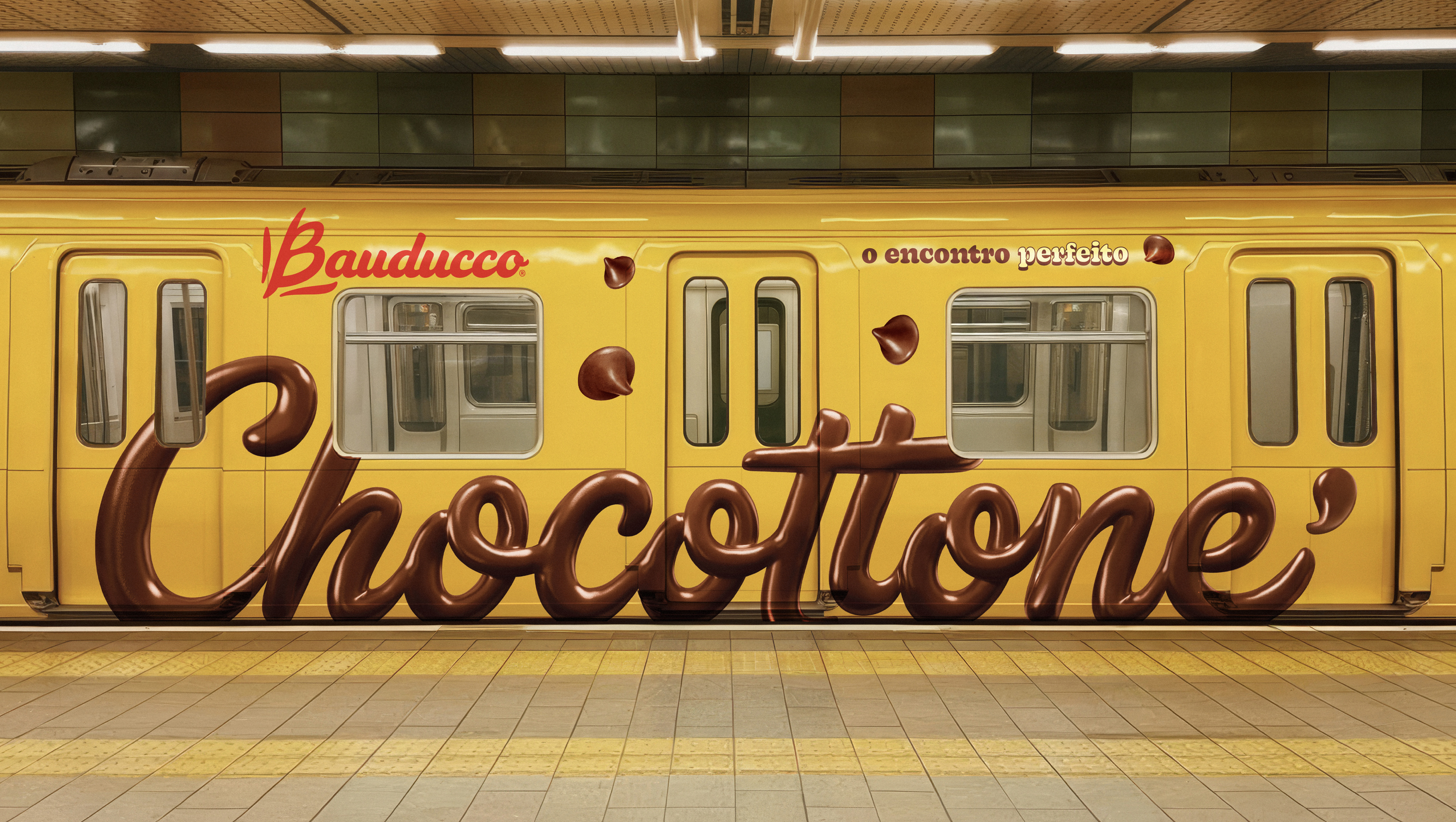
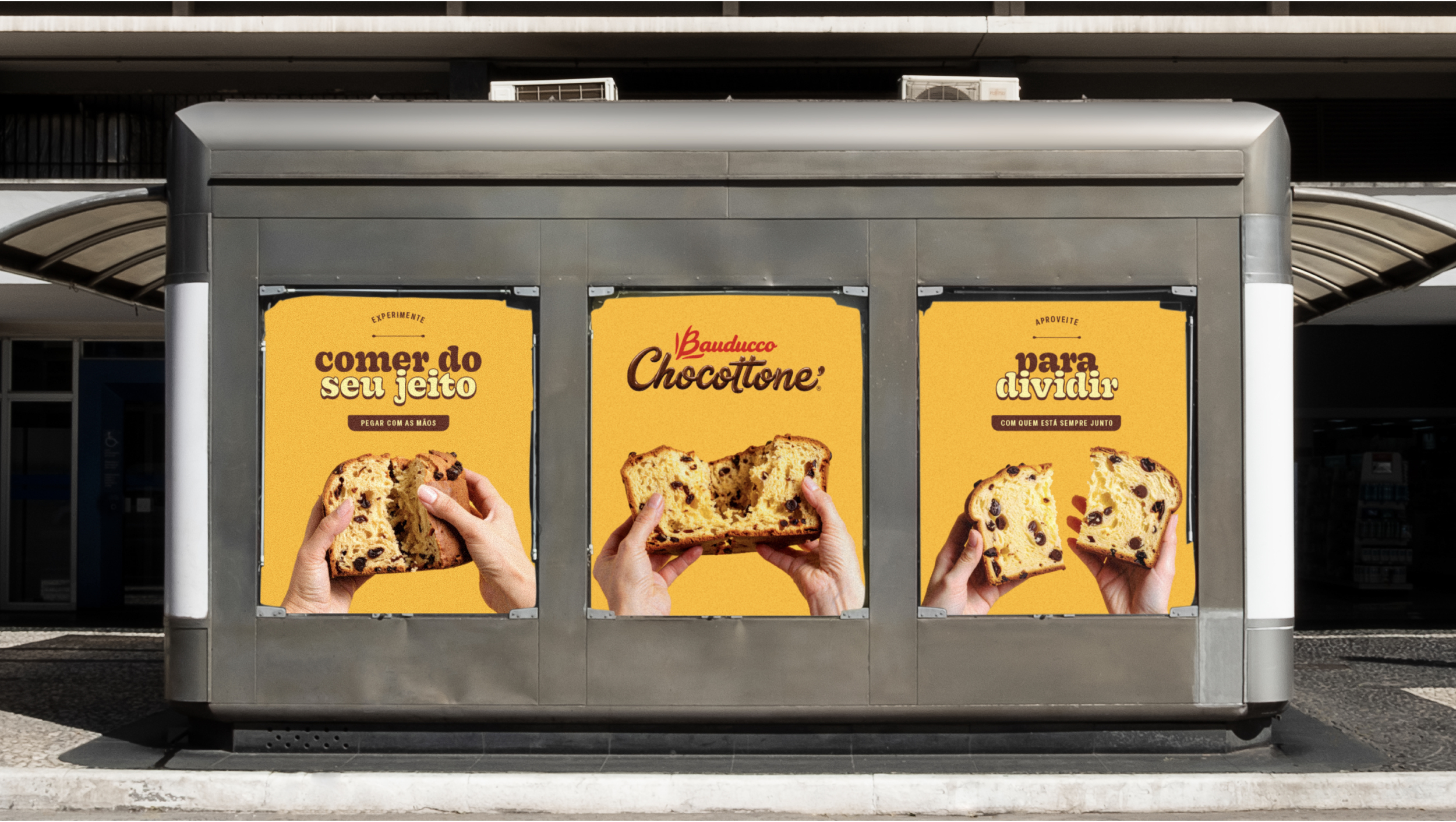
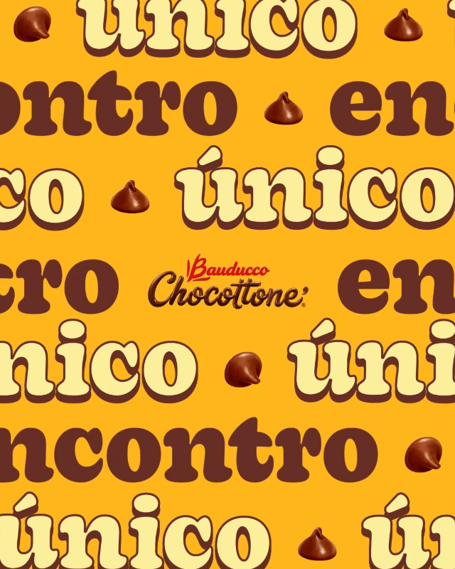
Bauducco Chocottone is an iconic holiday treat that has become synonymous with festive joy and indulgence in Brazil and beyond. Part of the renowned Bauducco brand, Chocottone is a rich, soft sweet bread filled generously with premium chocolate chunks — a delicious twist on the traditional Italian panettone.
Celebrated for its light, fluffy texture and deep, comforting flavors, Bauducco Chocottone bridges tradition and contemporary taste. It brings together the best of classic Italian baking heritage and modern indulgence, making it a favorite for celebrations, gatherings, and everyday moments that deserve something special.


NATURA BOTHANICA 🌱
CLIENT
NATURA
NATURA
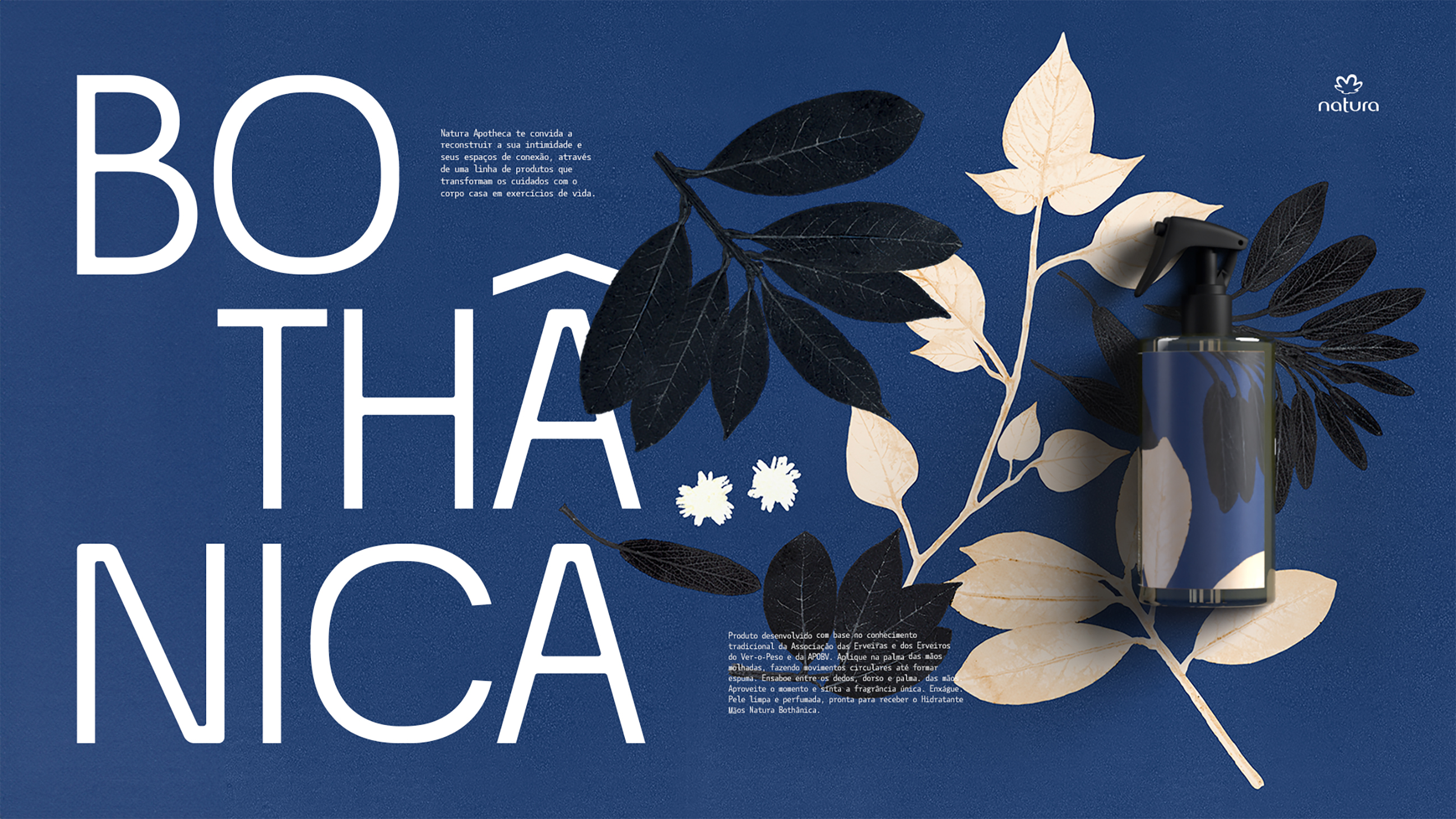
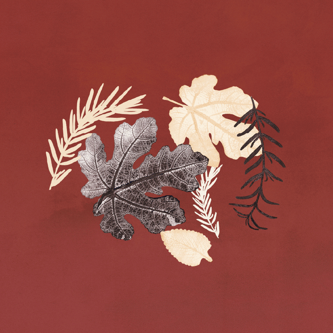
Natura Bothânica
Project: Pharus Bright
Project: Pharus Bright
PROJETO
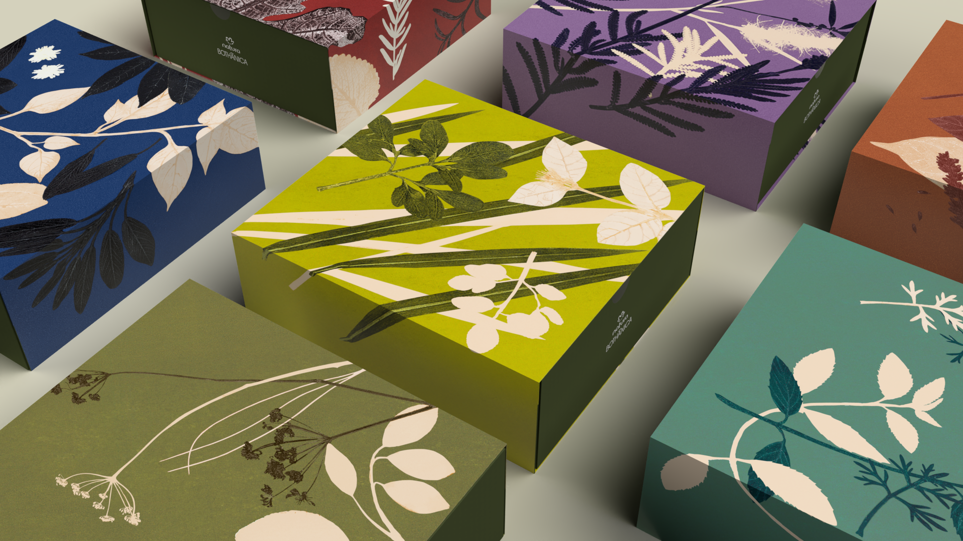
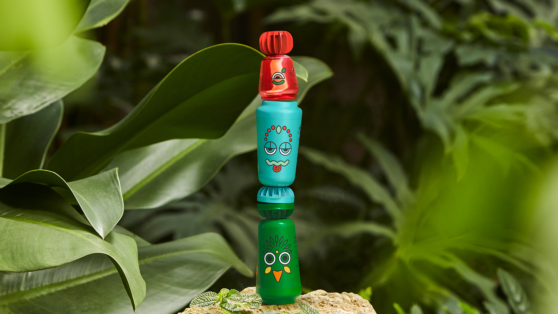
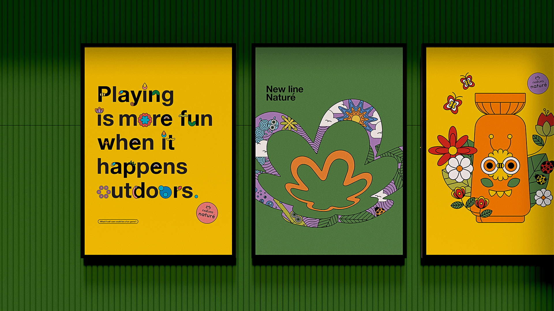
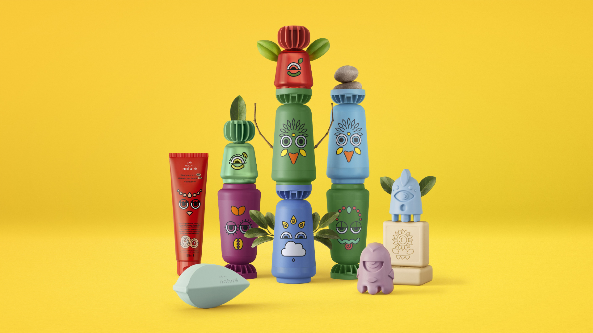
Together with the team from Xilomóvel Ateliê Itinerante (@xilomovel), we created a series of monotypes inspired by the brand’s fragrances, using the actual ingredients from each formula. These are representations that unveil a Latin American identity while also expressing the scent of each ingredient through forms and colors.
The results were powerfully and uniquely integrated into the packaging and visual language, bringing poetry and art to an elegant Latin-Brazilian essence that flows through both home and body.


NATURA BOTHANICA 🌱
CLIENT
NATURA
NATURA
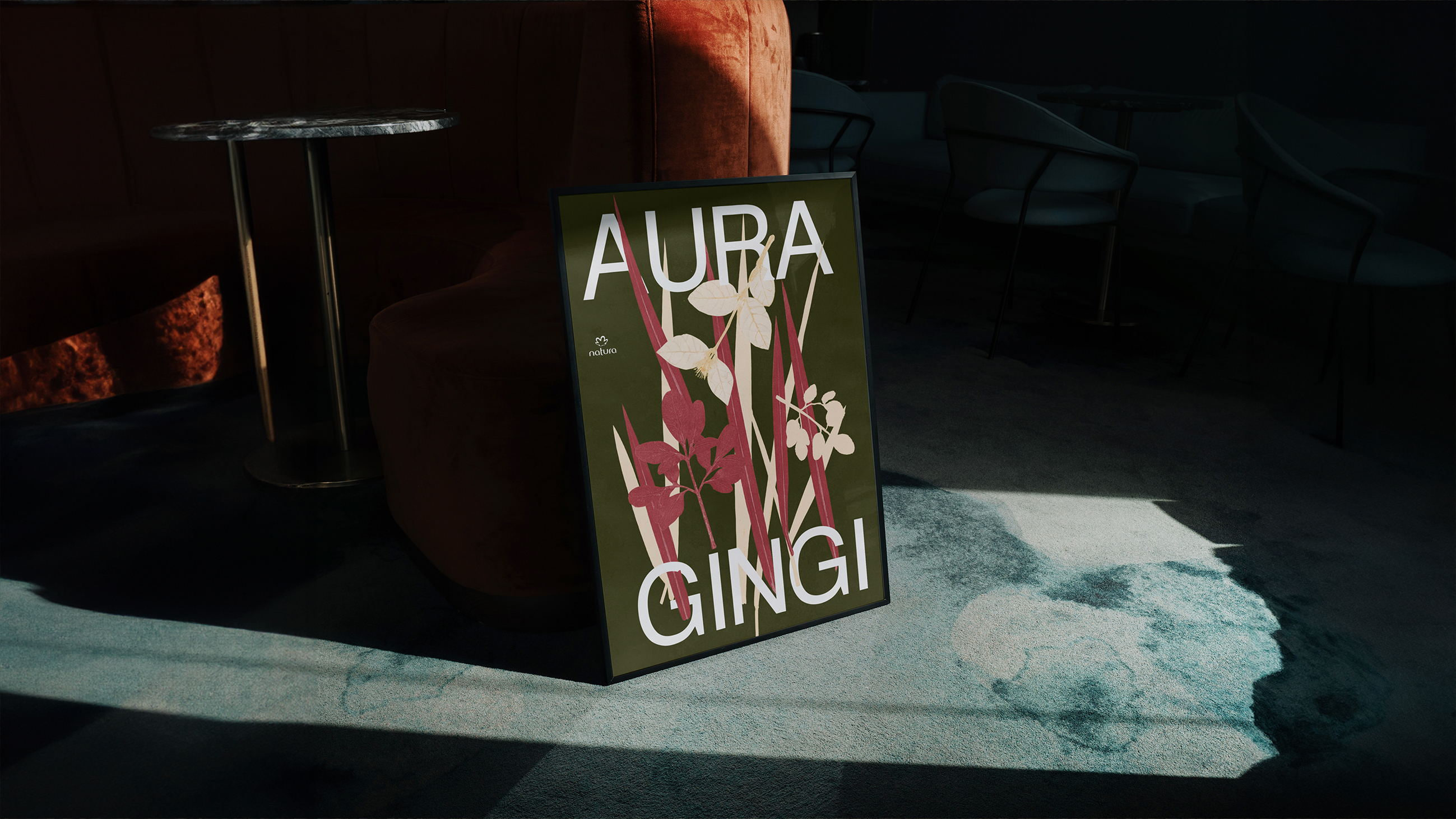
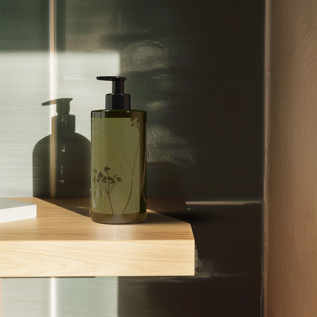
Natura Naturé
Project: Pharus Bright
Project: Pharus Bright
PROJECT
Together with the team from Xilomóvel Ateliê Itinerante (@xilomovel), we created a series of monotypes inspired by the brand’s fragrances, using the actual ingredients from each formula. These are representations that unveil a Latin American identity while also expressing the scent of each ingredient through forms and colors.
The results were powerfully and uniquely integrated into the packaging and visual language, bringing poetry and art to an elegant Latin-Brazilian essence that flows through both home and body.


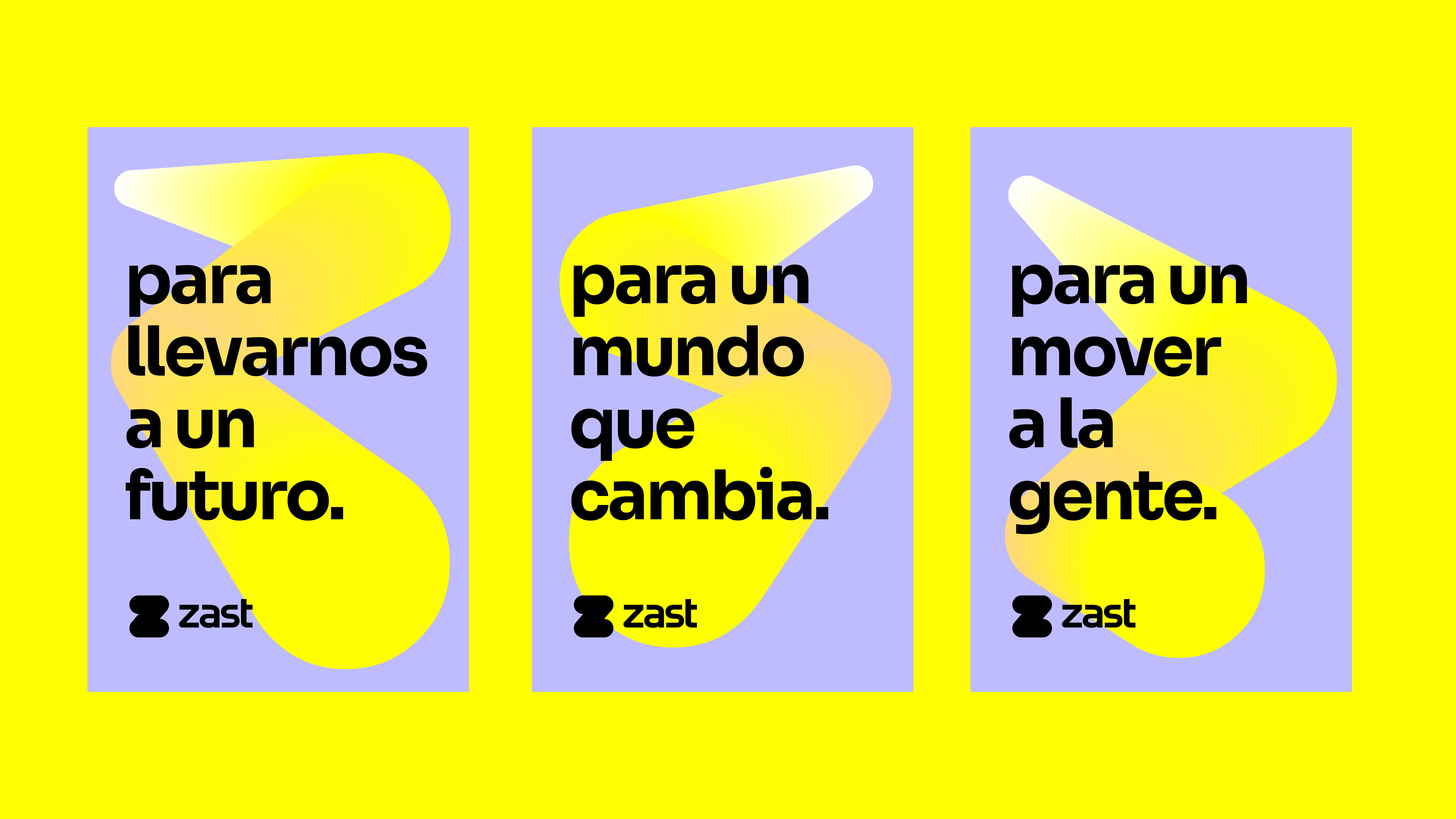
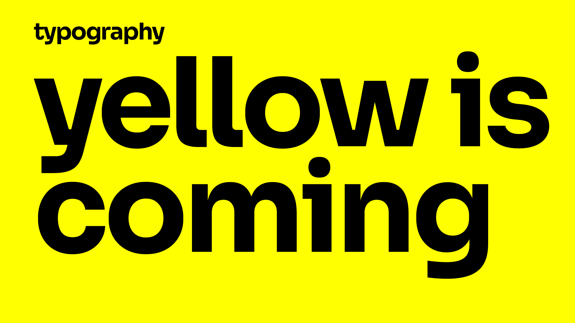
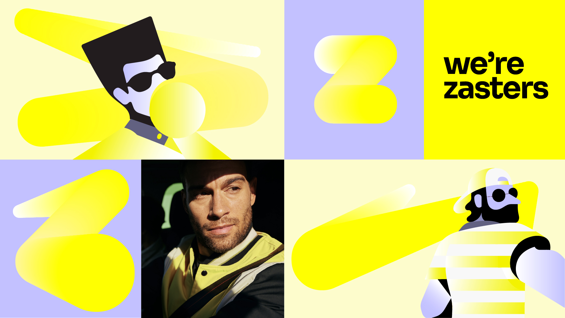
ZAST 🌞️
CLIENT
TIGO
TIGO
Project: Visual identity
PROJECT
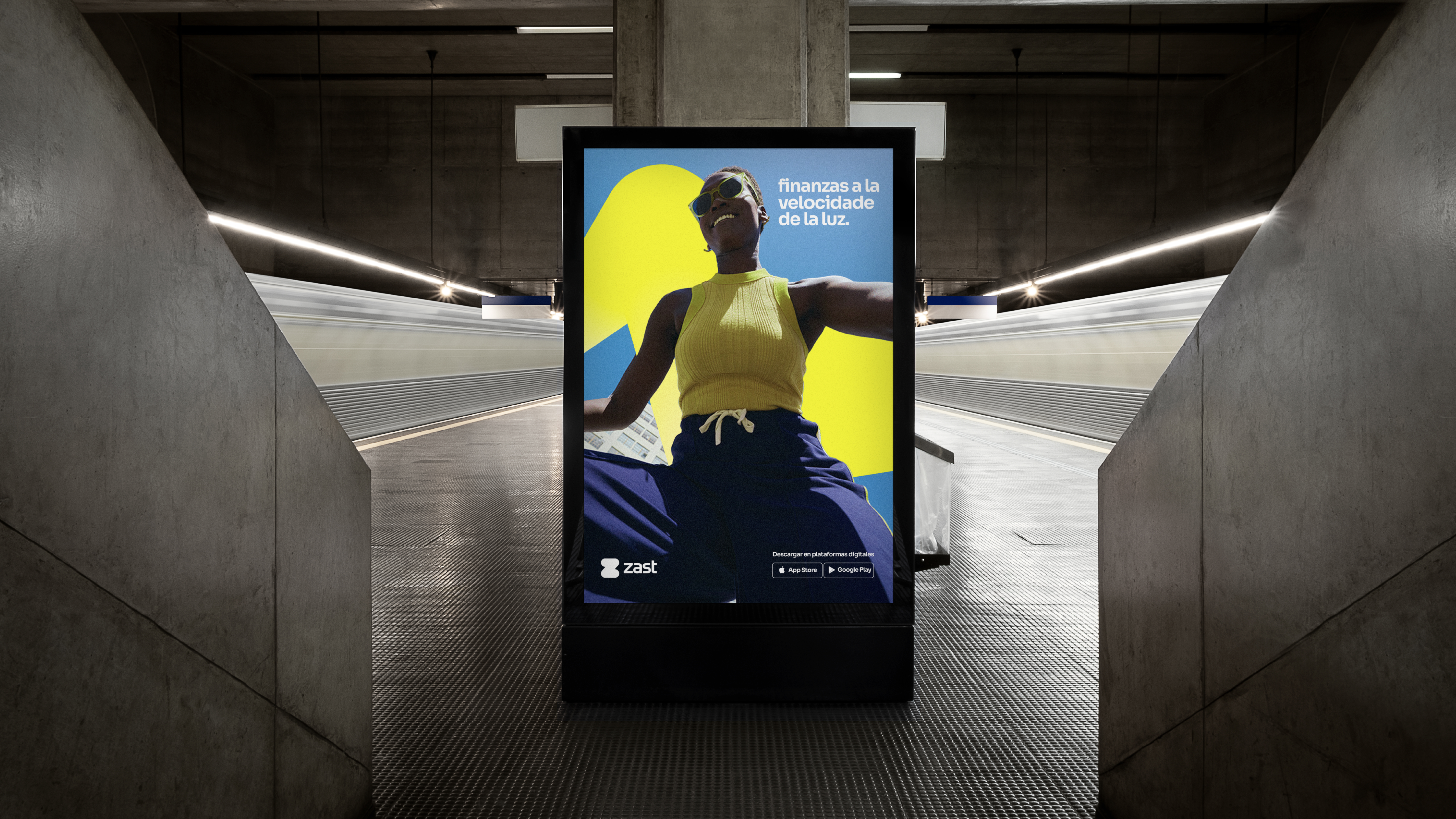
Zast was born as the fintech of Tigo, one of Latin America’s leading telecommunications brands, bringing into the financial universe the same values of connectivity, accessibility, and dynamism that define its parent brand. Designed to simplify access to credit and payment solutions, Zast positions itself as an agile, intuitive service that’s always in motion — reflecting the fast pace of digital life. With a vibrant visual language and an identity centered on fluidity and practicality, Zast connects people, opportunities, and new financial possibilities with the same efficiency that Tigo uses to connect voices and data across the continent.
Zast was born as the fintech of Tigo, one of Latin America’s leading telecommunications brands, bringing into the financial universe the same values of connectivity, accessibility, and dynamism that define its parent brand. Designed to simplify access to credit and payment solutions, Zast positions itself as an agile, intuitive service that’s always in motion — reflecting the fast pace of digital life. With a vibrant visual language and an identity centered on fluidity and practicality, Zast connects people, opportunities, and new financial possibilities with the same efficiency that Tigo uses to connect voices and data across the continent.


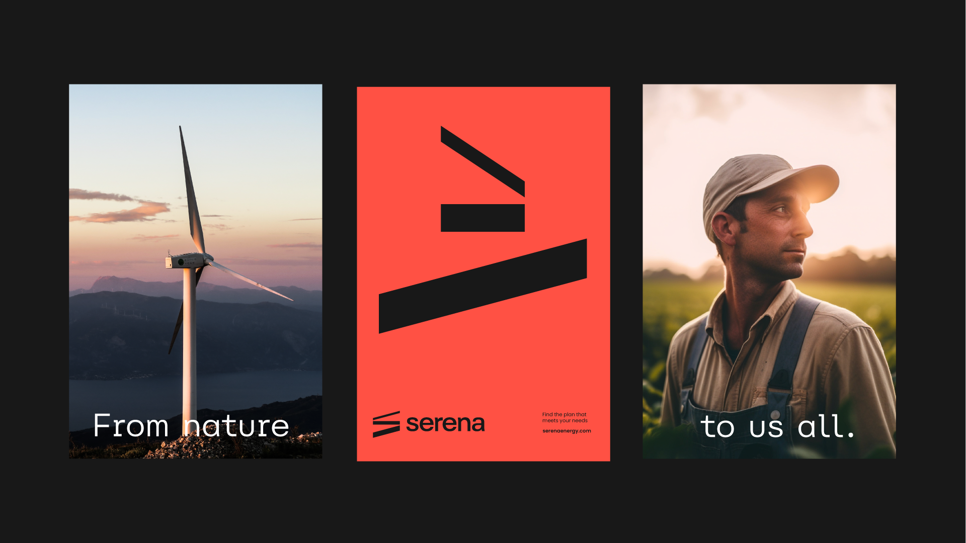
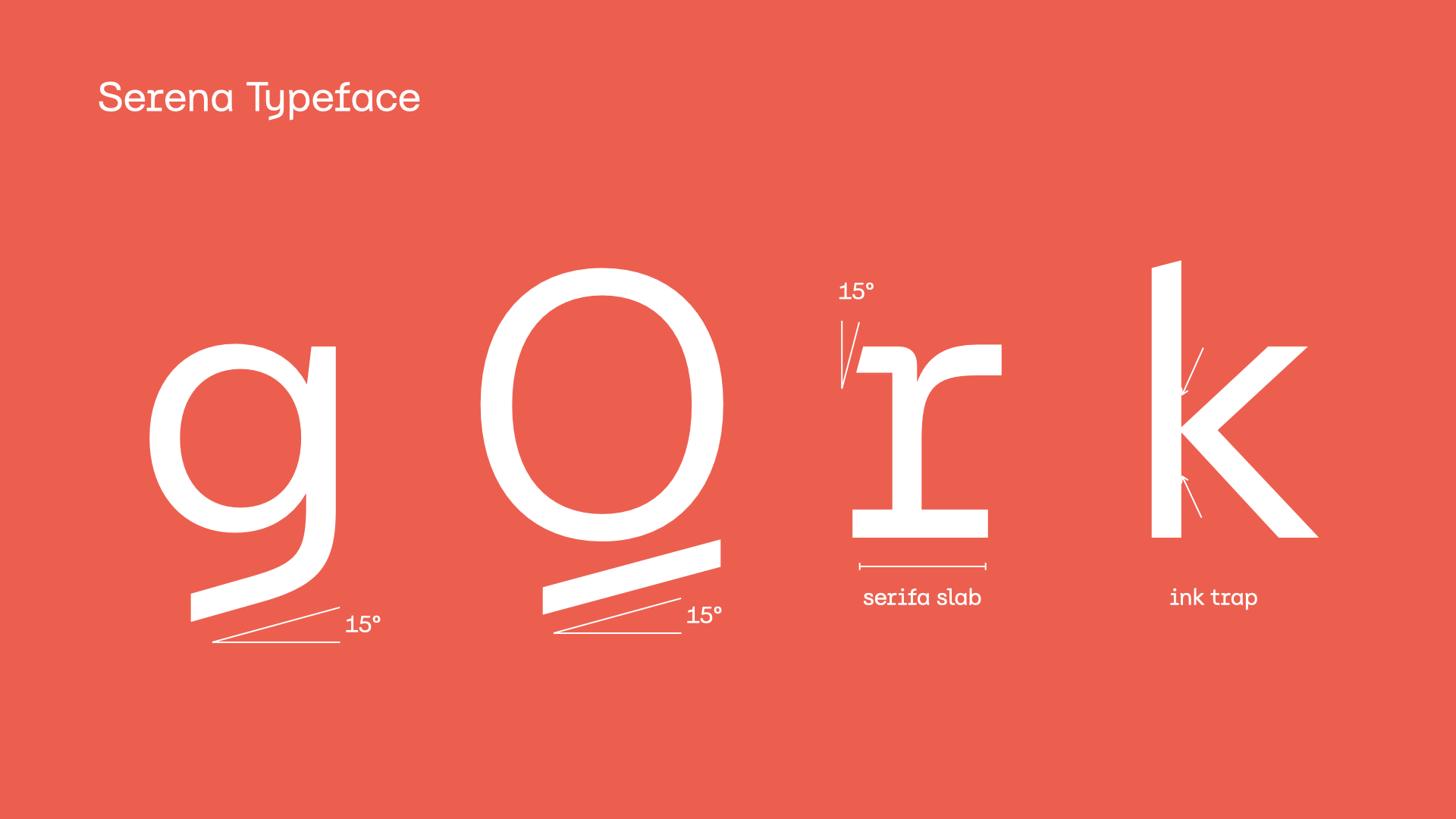
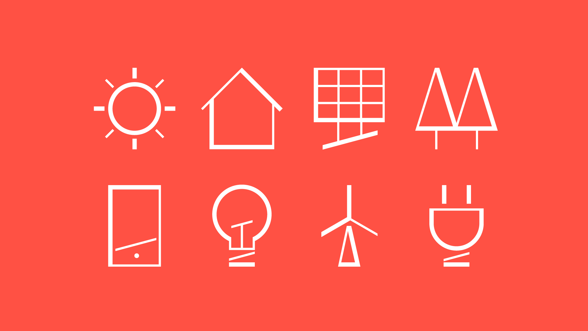
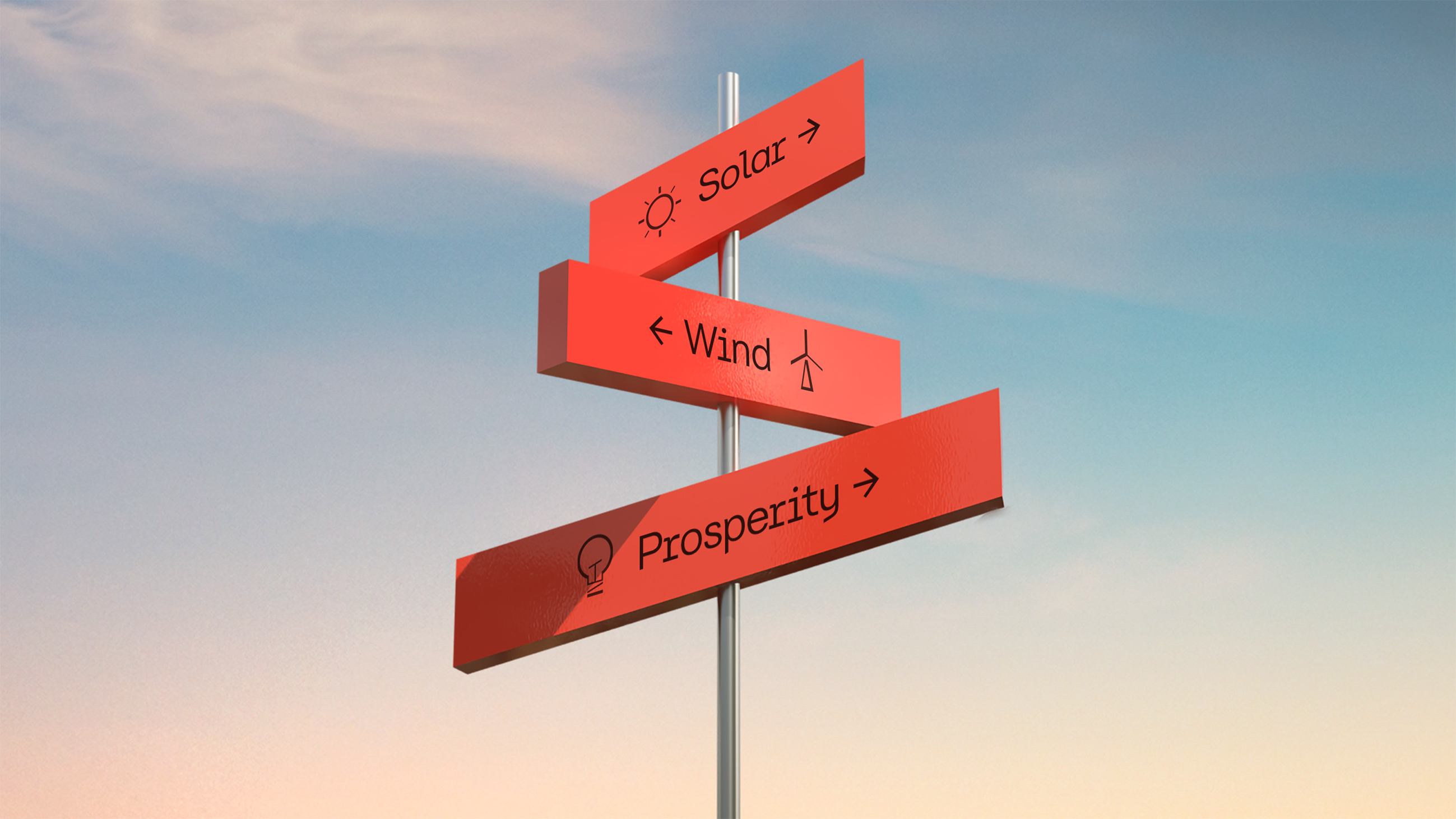
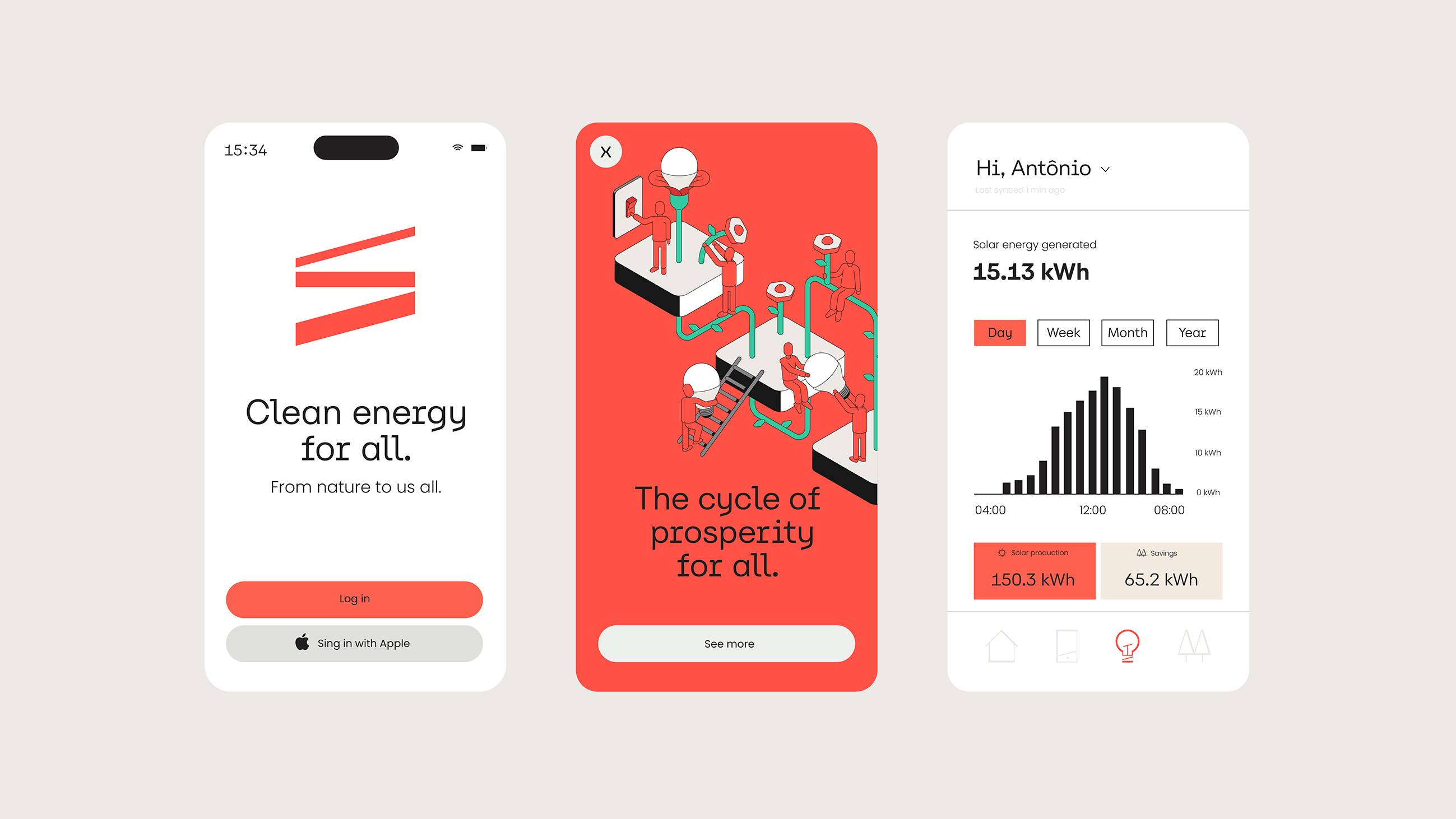
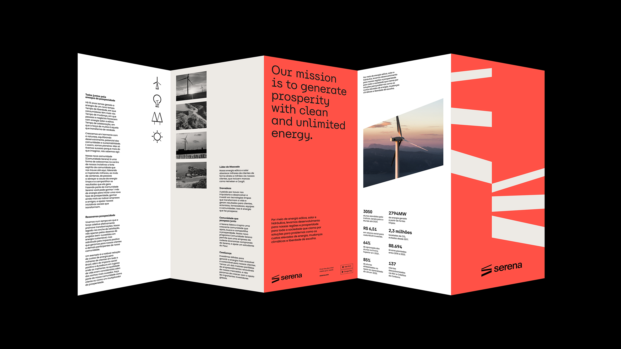
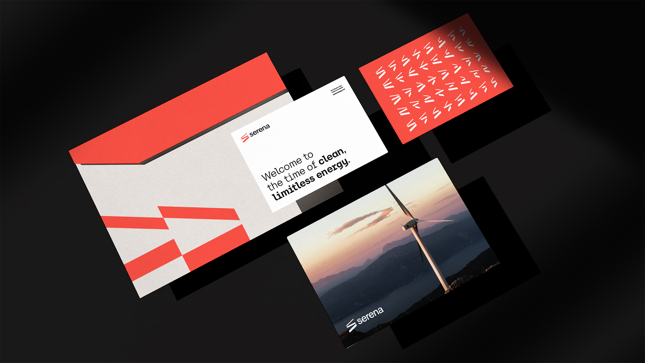
SERENA 💡️
CLIENTE
SERENA ENERGIA
SERENA ENERGIA
Serena Energia
Project: Pharus Bright
Project: Pharus Bright
PROJECT
Serena, formerly known as Ômega, has been active in the Brazilian renewable energy market since 2010 and entered the U.S. market in 2022 by acquiring the "Goodnight" wind farm project in Texas.
This growth brought the challenge of finding a relevant value proposition (B2C and B2B) for its markets in both Brazil and the U.S., while also enabling its expansion into other markets.
Inspired by the mobile—a type of sculpture moved by the wind that conveys lightness and charm—a powerful icon and graphic element emerged for the visual language.
The color palette is led by a distinctive, iconic coral—a vibrant hue that expresses the brand’s passion for bringing clean energy to everyone.